Colour is one of the most powerful tools in a home. It shifts the mood of a room before a single piece of furniture is placed, changes how large or intimate a space feels, and communicates something deeply personal about the people who live there. Yet for most homeowners, choosing paint colours or committing to a colour palette feels overwhelming. Trends move quickly, advice online is often contradictory, and what looks stunning on a screen can feel completely wrong once it hits your walls in natural light. This guide cuts through the noise. Whether you are drawn to the quiet calm of sage green, the dramatic confidence of a black door, or the grounded elegance of warm grey, here is an honest, practical look at the interior design colour trends shaping homes right now and how to use them in a way that actually works.
Why Colour Trends Matter More Than You Think
Trends in interior colour are not simply about fashion. They reflect something broader about how we want to feel at home. After years of stark white and minimalist interiors, homeowners have moved decisively toward warmth, texture and character. The shift is not accidental. People are spending more time at home than ever before, and they want spaces that feel genuinely comfortable, not just photogenic.
Understanding colour trends helps you make informed decisions rather than impulsive ones. A colour that feels fresh today and timeless in five years is always a better investment than one that looks dated before the paint has fully cured. The trends covered here share one important quality: they are all grounded in something enduring, whether that is nature, craftsmanship or a return to genuine warmth.
Sage Green: The Colour That Changed Everything
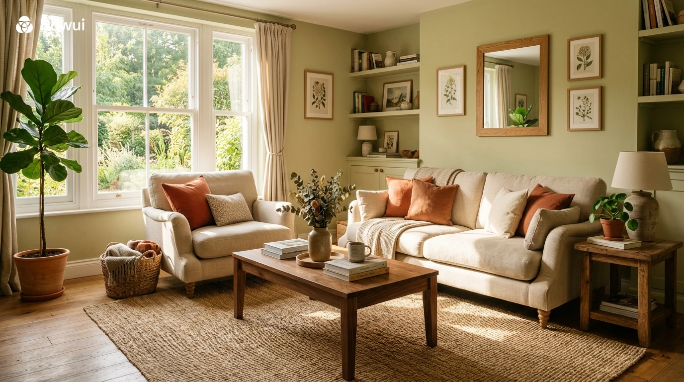
If there is one colour that has defined the shift in interior design over the past few years, it is sage green. Soft, dusty, and unmistakably organic, sage green sits somewhere between grey and green with just enough warmth to feel lived in rather than clinical. It has appeared on kitchen cabinetry, bedroom walls, bathroom tiles and living room sofas with remarkable consistency, and it shows no sign of disappearing.
Why Sage Green Works So Well Indoors
Sage green succeeds because it behaves like a neutral while still having genuine personality. It reads as calm without being cold. In a north facing room where light is cooler and flatter, sage green with a slightly warm undertone will hold its character without turning muddy. In a south facing room flooded with afternoon sun, the same colour glows with a softness that feels almost like being outside.
The key to using sage green successfully is understanding its undertones. Some versions lean blue grey, which feels more Scandinavian and refined. Others lean yellow or khaki, which feels more natural and earthy. Before committing, paint large sample patches and observe them at different times of day. What looks greenish at midday may read as grey by evening.
Where and How to Use Sage Green
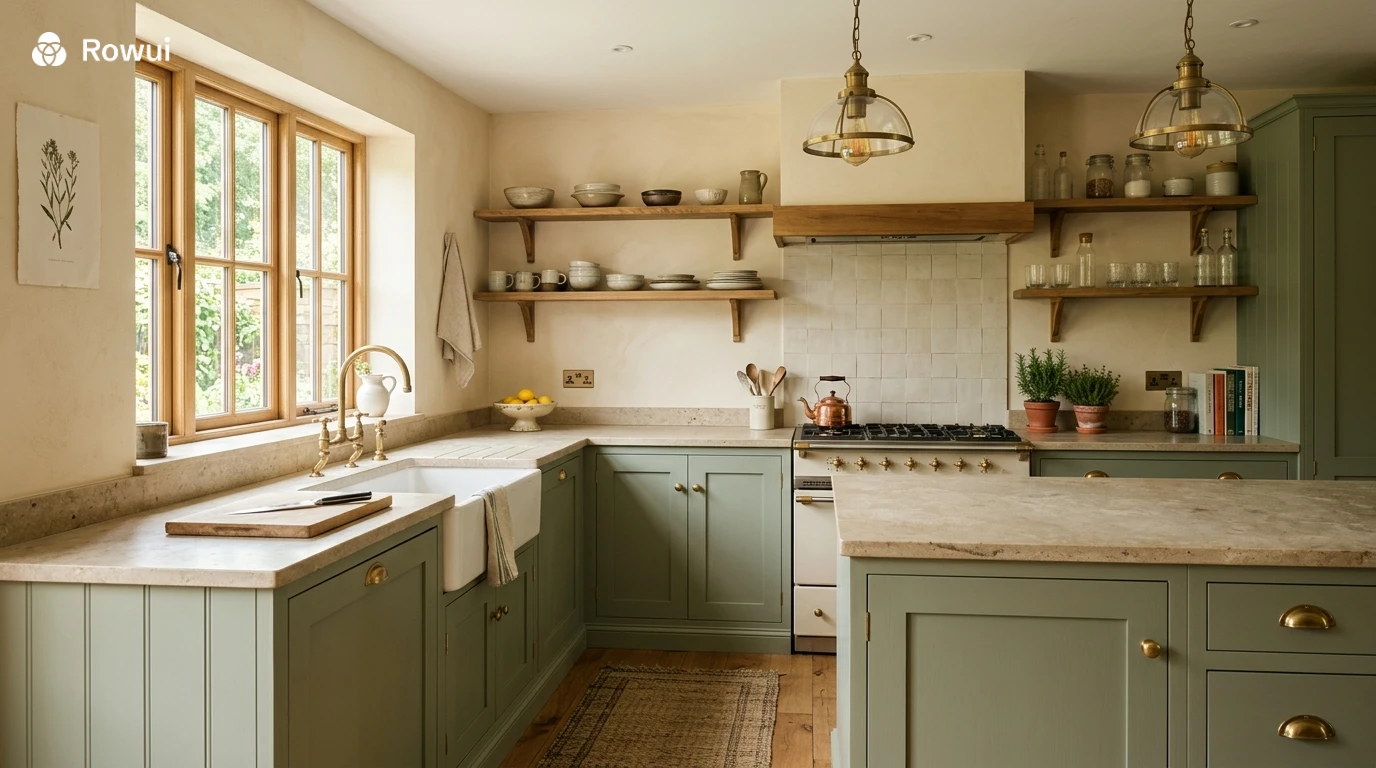
Sage green works particularly well as a kitchen cabinet colour paired with brass or unlacquered bronze hardware, stone worktops and open wooden shelving. This combination has become a signature look for a reason: the warm metal tones bring out the green without competing with it, and the natural materials ground the palette in something tactile and real.
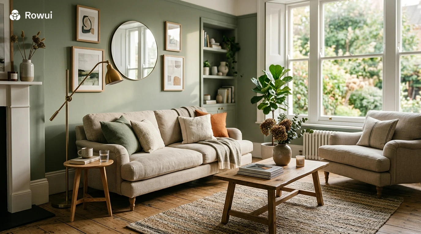
In a living room, sage green walls paired with deep terracotta cushions, off white linen and warm walnut furniture create a palette that feels both contemporary and timeless. Avoid pairing sage green with cool greys or bright whites as they tend to flatten its warmth. Cream, warm white and natural flax tones are far more sympathetic companions.
For bedrooms, sage green is quietly transformative. At lower light levels in the evening it becomes almost meditative, creating exactly the kind of calming backdrop that promotes rest. Combine it with white cotton bedding, aged oak furniture and soft warm lighting for a room that feels genuinely restorative.
Pastel Colours: Grown Up and Grounded
Pastel colours in interior design have had something of a reputation problem. For a long time they were associated with nurseries and dated country cottage aesthetics. That association has largely dissolved. The pastel palette being embraced right now is more sophisticated, more architectural and much more intentional than its predecessors.
The New Generation of Interior Pastels
The pastels gaining ground in contemporary interiors are not pale versions of bright colours. They are complex, slightly dusty, and often mineral in quality. Think powdery blush with a terracotta undertone rather than baby pink. Think chalky lavender with a grey base rather than lilac. Think pale butter yellow with an ochre warmth rather than lemon. These are colours that have been quieted rather than simply diluted, and the difference is significant.
Pale blush used across an entire bedroom wall creates a warmth that flatters the occupants and makes the space feel intimate without feeling small. Chalky lavender in a bathroom applied to both walls and ceiling in a tonal approach creates a cocoon like quality that feels luxurious rather than whimsical. Dusty butter yellow in a kitchen or dining room brings the energy of a sunny day indoors even in the depths of winter.
Combining Pastels with Stronger Elements
The mistake many homeowners make with pastels is surrounding them with too many other soft tones. A room of pastels alone becomes insubstantial. The secret is contrast. Pair pale blush walls with dark bronze light fittings, deep olive green textiles and raw linen curtains. Pair chalky lavender with dark stained timber floors and white plaster cornicing. The pastel becomes the star precisely because it is given something firm to stand against.
Teal: Depth, Drama and Confidence
Teal sits at the intersection of blue and green, and it brings something that neither colour manages alone. It has depth without heaviness. It has drama without being aggressive. Used well, teal colour in interior design creates spaces that feel collected, considered and genuinely sophisticated.
Using Teal in Living Spaces
Teal works exceptionally well in spaces where you want presence. A teal sofa in an otherwise neutral room anchors the entire space and does the work of three accent pieces at once. A teal painted wall used as a feature in a study or home library creates the kind of environment that feels like it was designed rather than assembled.
One of the most effective uses of teal is in combination with natural brass and warm wood. The slight yellow warmth of brass pulls the green out of teal and creates a dialogue between the two tones that feels organic and refined. Pair a teal velvet armchair with a brass floor lamp, warm oak side table and cream walls for a combination that is genuinely difficult to fault.
Teal in Kitchens and Bathrooms
In kitchens, teal cabinetry has an almost maritime quality that works particularly well in homes near water or with good natural light. It pairs beautifully with white or cream walls, concrete or limestone worktops and brushed nickel or aged brass hardware. The combination feels fresh, considered and far removed from the grey kitchen trend that preceded it.
In bathrooms, teal tiles used floor to ceiling create a bold, immersive experience. Paired with white grout, white sanitary ware and brushed gold taps, a fully tiled teal bathroom feels like something from a boutique hotel without requiring a hotel budget. Smaller bathrooms actually benefit from this approach: the strong colour makes the space feel deliberate rather than apologetically compact.
Grey Paint: Still Relevant, Finally Done Right
Grey has dominated interior design for over a decade, and in many homes it has been used thoughtlessly, producing spaces that feel cold, lifeless and interchangeable. But dismissing grey entirely would be a mistake. The problem was never grey itself. The problem was the specific greys that were overused and the way they were combined with cool whites and chrome finishes that drained every room of warmth.
Warm Grey Versus Cool Grey
The distinction between warm grey and cool grey in interior design paint is critical. Cool greys lean blue or purple and tend to read as clinical in artificial light. Warm greys lean beige, taupe or brown and hold their warmth across all light conditions. If you are going to use grey paint, start by identifying the undertone of the specific shade you are considering.
Popular warm greys from leading paint manufacturers often carry names that hint at their character. Pebble, stone, putty, greige and clay are all words that suggest warmth. Test these in your actual space before committing. A warm grey that reads beautifully in a south facing room with lots of natural light can look beige and flat in a north facing room where the light source is cooler.
Grey as a Foundation for Richer Colours
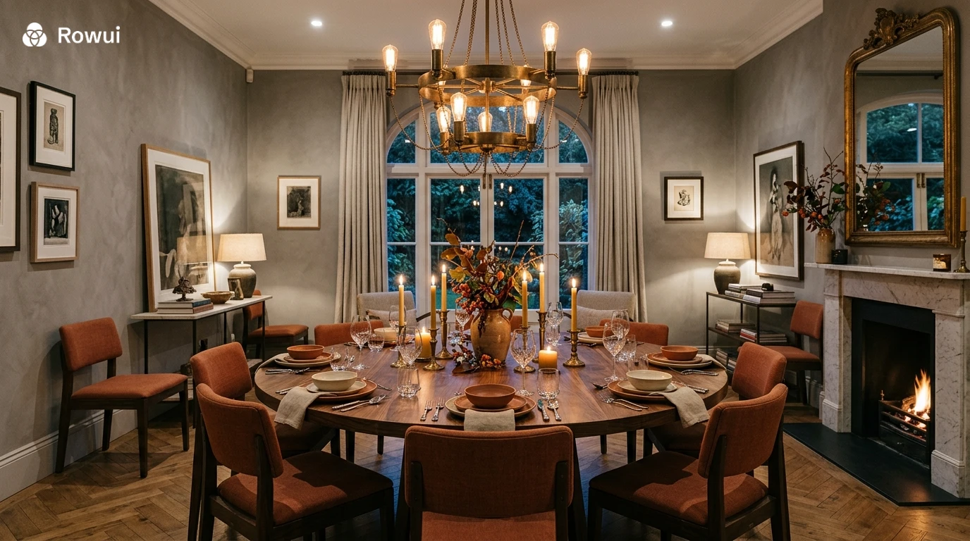
The most successful grey interiors being created right now use grey not as the hero colour but as the foundation. Warm grey walls become the backdrop for deeper, richer accent colours: aged terracotta, forest green, warm ochre, rust or navy. This approach allows the warmth and interest to come from layered textiles, artwork and furniture while the walls remain relatively quiet and flexible.
The Black Door Moment: Bold Exterior and Interior Statements
The black door has become one of the most talked about design details in both interior and exterior design. On the exterior of a home, a black front door signals confidence, creates an immediate focal point and dramatically elevates the entire facade, regardless of what the rest of the house looks like. Internally, black doors and black door frames have become a defining detail in contemporary homes that want to feel tailored and deliberate.
Black Front Doors and Exterior Kerb Appeal
A black front door works on almost any home style. On a Victorian or Edwardian terrace, it restores period gravitas. On a white rendered contemporary home, it creates a clean graphic contrast. On a red brick house, it grounds the warm tones of the brickwork and prevents the facade from feeling too rustic. The key is ensuring the door itself is substantial and well proportioned. A flat, featureless budget door painted black will not create the same effect as a panelled or glazed door with genuine character.
To make a black front door work at full impact, consider the elements that surround it. A simple brushed brass or gunmetal door handle, a recessed overhead light that washes down the door surface in the evening, and a pair of clipped topiary in dark stone planters either side will create an entrance that looks genuinely considered. Even the simplest home benefits enormously from this level of attention to the arrival experience.
Black Interior Doors and Frames
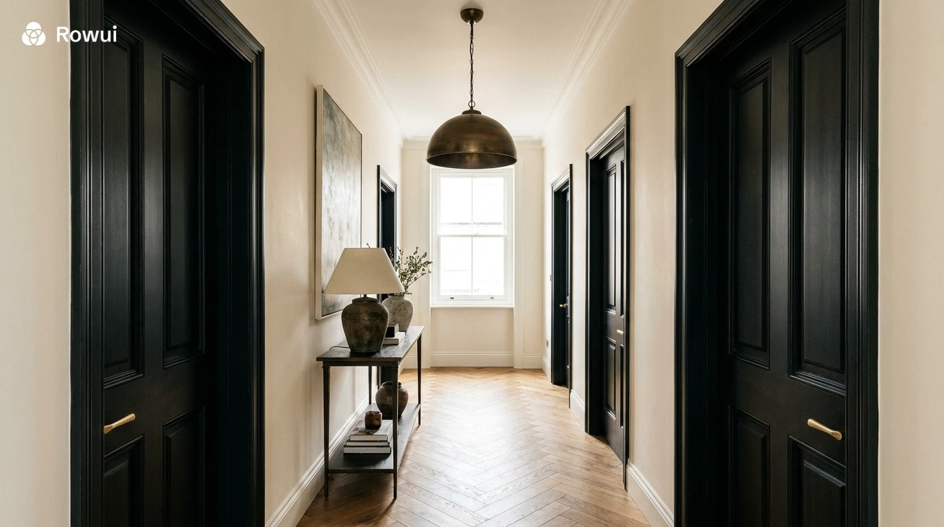
Inside the home, black interior doors create visual anchoring points throughout a space. In a hallway painted in a warm off white, black painted doors with simple period mouldings create a crisp graphic quality that makes the entire space feel more intentional. In an open plan living and kitchen space, black steel framed glazed internal doors are one of the most effective ways to divide areas without losing light or spatial continuity.
Black door frames and architraves paired with white or cream walls have become a signature look in renovated period homes. The combination references traditional craftsmanship while feeling thoroughly contemporary. It also has a practical advantage: it hides scuffs and marks far more effectively than white painted woodwork, which requires frequent touching up in high traffic areas.
Bringing Colour Trends Together: Building a Cohesive Palette
The risk with following multiple colour trends is ending up with a home that feels like a series of disconnected rooms rather than a coherent whole. The most successful homes use a consistent thread that runs through every space, allowing individual rooms to have their own character while still feeling like they belong to the same house.
Establishing a Whole House Colour Flow
Start with your hallway and main circulation areas. These are the spaces that connect every room and they should carry a colour that transitions easily in all directions. A warm greige, a soft clay or a pale natural white works well here. From this neutral spine, individual rooms can step towards stronger colours: sage green in the kitchen, teal in the living room, dusty blush in the main bedroom. Each room has its own identity but shares enough tonal warmth to feel connected.
Skirting boards, doors and window frames in a consistent colour throughout the house create visual continuity even when wall colours change from room to room. Whether you choose a warm white, a soft off white or the increasingly popular dark charcoal for woodwork, consistency in these elements acts as a unifying frame around the changing palette of each room.
The Role of Lighting in Colour Accuracy
No colour exists independently of the light that falls on it. Natural light changes dramatically throughout the day and varies significantly between rooms depending on aspect and window size. Artificial light adds another layer of complexity. Warm incandescent bulbs amplify yellow and orange tones while suppressing blues and greens. Cool daylight bulbs do the opposite.
When planning your interior colour palette, always test paint colours in the actual room, on large patches of wall, at different times of day and under the artificial lighting you plan to use. A colour that looks perfect under a showroom spotlight may look completely different under the warm glow of table lamps in the evening. This simple step prevents the majority of paint regrets.
Conclusion: Choose Colour With Intention
The most enduring interiors are not built around what is trending. They are built around what is true to the people who live in them, supported by an understanding of how colour actually behaves in space. The trends covered here, sage green, sophisticated pastels, teal, warm grey and the graphic confidence of black, share a common quality: they reward careful consideration rather than impulsive application.
Take time to understand the light in your home. Test colours properly. Build a palette that flows through your spaces rather than treating each room in isolation. Invest in quality paint and quality hardware because these are the details that determine whether a colour scheme feels polished or approximate. And trust that when colour is chosen with genuine intention, it transforms not just the appearance of a home but the experience of living in it.